Project 2: Andorid play store apps analysis
Data visualisation with the help of a case study. It enable us to understand how visualisation aids in solving business problems
Data Handling and Cleaning Techniques
-
Missing Values
- Dropping the rows containing the missing values
- Imputing the missing values
- Keep the missing values if they don’t affect the analysis
-
Incorrect Data Types
- Clean certain values
- Clean and convert an entire column
-
Sanity Checks: The data that we have needs to make sense and therefore we can perform certain sanity checks on them to ensure they are factually correct as well. Some sanity checks can be:
- Rating is between 1 and 5 for all the apps
- Number of Reviews is less than or equal to the number of Installs
- Free Apps shouldn’t have a price greater than 0
-
Outlier Analysis: Start identifying and removing extreme values or outliers from our dataset. These values can tilt our analysis and often provide us with a biased perspective of the data available
- Use a boxplot to observe, analyse and remove them
- Also, we should determine whether or not removing them would add value to our analysis procedure
Plots used for visualisation
-
Histogram plots
-
Scatter plots
-
Box plots
-
Pie charts
-
Bar charts
-
Pair plots
-
Line plots
-
Stacked bar charts
-
Historgram: Histograms can also be used in conjuction with boxplots for data cleaning and data handling purposes
Some questions we can answer based on our analysis
- Does a higher size (Megabyte) or price necessarily mean that an app would perform better than the other apps?
- Or does a higher number of installs give a clear picture of which app would have a better rating than others?
- Many more!
For full details and implementation
Some visualisation snapshots and observations!
Ratings across the 4 most popular Genres
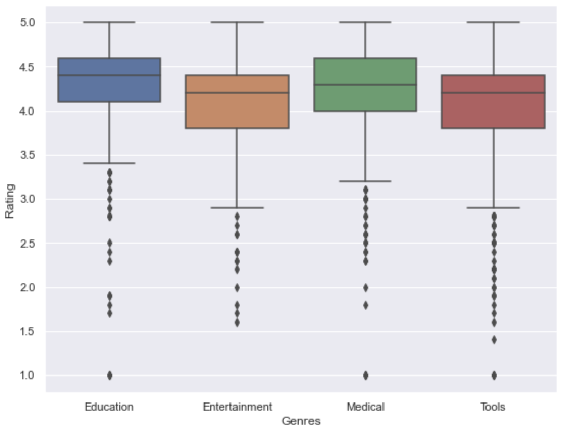
- Sorted records based on the 4 most popular genres
- Visualise the spread of rating data in all four popular genres
Distribution of Ratings w.r.t Price
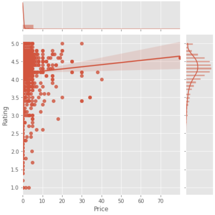
- Most of the popular apps (high rated) having price range between 0(Free) to $10
Stacked bar chart w.r.t the proporion
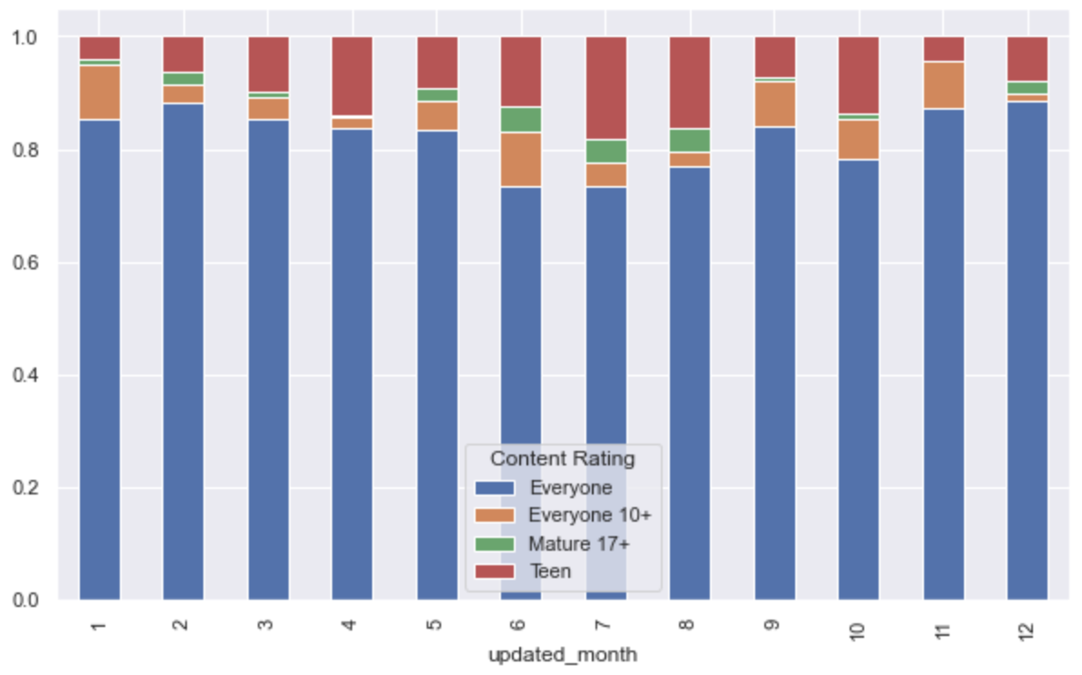
- Some of the apps restricted for below 18, some are suitable for teen, some of them used by everyone etc
- Monthly basis visualisation for content rating type
- For example, In january month more than 80 % of rating given by everyone content type